Official Town Mark Benefits from Overdue Facelift
The Town of Sahuarita logo appears throughout the local municipality and the region. Brand equity and stakeholder buy-in on the old mark made change an uphill battle, but one that was worthwhile for the benefit of aesthetic quality, public perception, and accessibility standards in print and online.
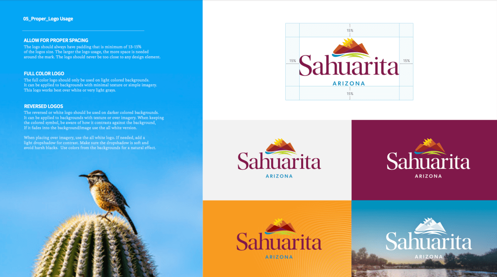
Variations of the one-color mark were many, and none met standards for embroidery or imprint projects that were essential for uniforms, vehicles, street signs, awards, and more. The challenge was maintaining the integrity of the redesigned mark while leveraging design expertise to develop a refined version that checked all the boxes.

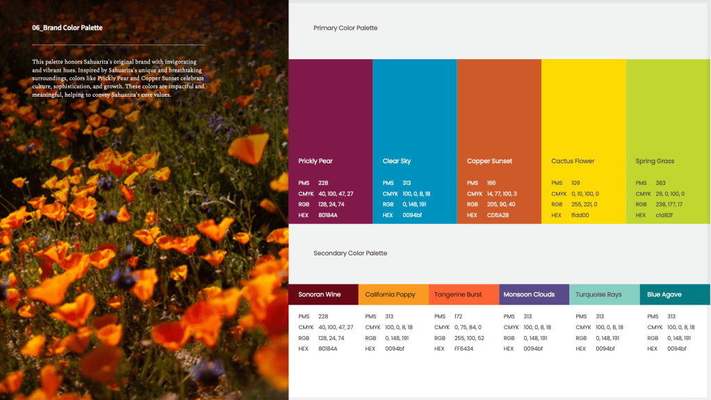
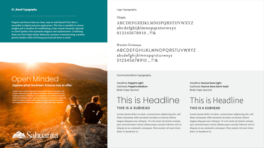
In addition to the mark revision process, a revised color scheme and brand style guide were developed to ensure consistency in implementation for years to come.

Role Call: Design Strategy and Art Direction by Hailee Tavoian; Logo Graphic Design by Richie Brevaire and Kailee Slusser, Brand Guide and iconography by Heather Valdez.

Leave a comment